The forgotten Project
Posted
#1668
(In Topic #377)

A semi tutorial for the site.
This is a project i should have finished for Christmas!! I had/have so much going on i had forgotten about it.In some ways this is now top priority to get online. The thread is actually a semi tutorial for the person the site is for. Its just a way to show them how i changed the bits i do change.
Some tiny bits have been changed already, so for those using this as a basic guide, dont worry as some of the small changes will be changed again later. So you will get to see how i did it.
The site is for a young lady, who no longer is young enough to be involved, in my schools science project. However i bumpped into her dad, he mentioned she was still enjoying science, and how she missed some the crazy science lessons we did.
This young lady was one of a number of students, who looking back, gave me a reason to keep going with the project.
In short they made all the agrevation (there was plenty), well worth it. The familly are just one of those, that you would find it hard to say a single bad word about. Resources are pretty limited, as in most young hardworking famillies, so i decided to help.
I have a old laptop that would run Linux pretty good, and some spare space on a shared host server. So i decided i would donate the laptop to this young scientist, and build her a site. The site is for her and any friends she invites, to learn about science, it is also a place she document her experiments. It also allows me a easy medium, in which i can upload experiments, for her to try at home. It is also an easy way for her to ask me questions, or get help with her studies.
I had informed her dad what i would do, so i am really behjind with this!! I am not looking for perfection, i would like to spend no more than a week, using the spare few hours i get. I can polish it up later for her.
So this if you like is the story of a website, that may just inspire a talented youngster to keep on with science, i firmly believe with some nurtering, this student has a extremely bright future in science if she wishes.
So Ms M, this is how your site was born!
Keep in mind this is my way, that does not mean its, the only, or the correct way!
So we are going to start here.

I want to make this as individual as i can, i also want it to be suitable for the age group, and also 'serious' at the same time. While the student is alot of fun, they always struck me as a 'serious' type of person!
So first things first, we go into ACP and copy the theme, its easier (for me) to just show a screen shot of what and where.

So we have gone to ACP and manage themes, click on the theme you want to change.
then i did the following.

My randome starting point will be the log in box, no particular reason. many will want to use the wizard and that is fine, i am choosing at the moment not to, again this isnt for any particular reason, except maybe so i can learn the software a little deeper.
So we fire up developer tools, in my case firefox ones, we take a look with inspector, and see where in the code we can find the box.
Probe around with the inspector all over the box area, this gives you an idea what files are involved.
So we find two main files we need to look at. These seem to be messages.CSS and Global.CSS as seen below.


the rules in messages.css seem to involve the display of the actual box, things like Margins etc. The great thing with developer tools is you can change things, using the tools and not actually make any 'real' changes. As an example the following is the current rule, lets see what it does by altering some values.
.closed_site_special_message {
margin: 10em auto;
width: 38em;
text-align: center;
}
If we untick boxes one by one this is what we see, so now we know exactly what this rule changes.

So we find it changes the posistion of the box, the tex inside the box. But it dosnt change the border or border radius etc.
Part 2 coming up
![]() Last edit: by Chris Graham
Last edit: by Chris Graham
Posted
Part 2
I wanted to adjust the size of the login box and mess a bit with the layout and font (see google font question in other thread).In the end i sorted it out. To addd google fonts you need to alter the Global template, you do this in the following way.

You need to goto google fonts page and follow instructions there. It isnt too hard, or check the thread where i ask about google fonts, that should give enough information. At the moment all boxes using h2 tag, will have this font. I want to address that later, once i find out where and how to add tags in the templates :D.
Anyway this is what we have upto this point, keep in mind i am still deciding what other changes to make to this page. so i am likely to come back to it later and alter it, once i learn a little more.

I will edit this as i do it
![]() Last edit: by Chris Graham
Last edit: by Chris Graham
Posted
So now we look like this, i am going to alter the box a little bit more. maybe the border radius and a few other things. Using developer tools in the browser, we can play around until we are happy with the look.
![]() Last edit: by Chris Graham
Last edit: by Chris Graham
Posted
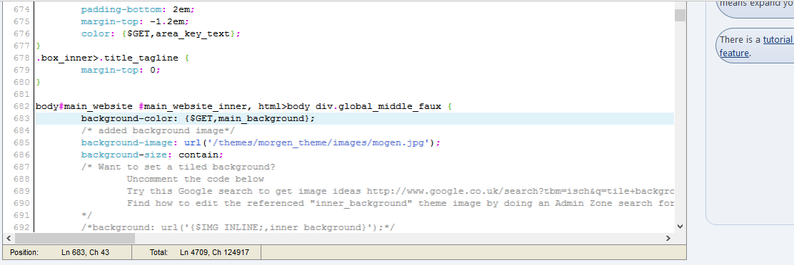
So a screen shot of the GLOBAL.CSS before a couple of edits, then same section after the edits, and the results. This should give you an idea of what we are changing and where it is, keep in mind we have to come back, and make sure we find a way to apply it only to that page.
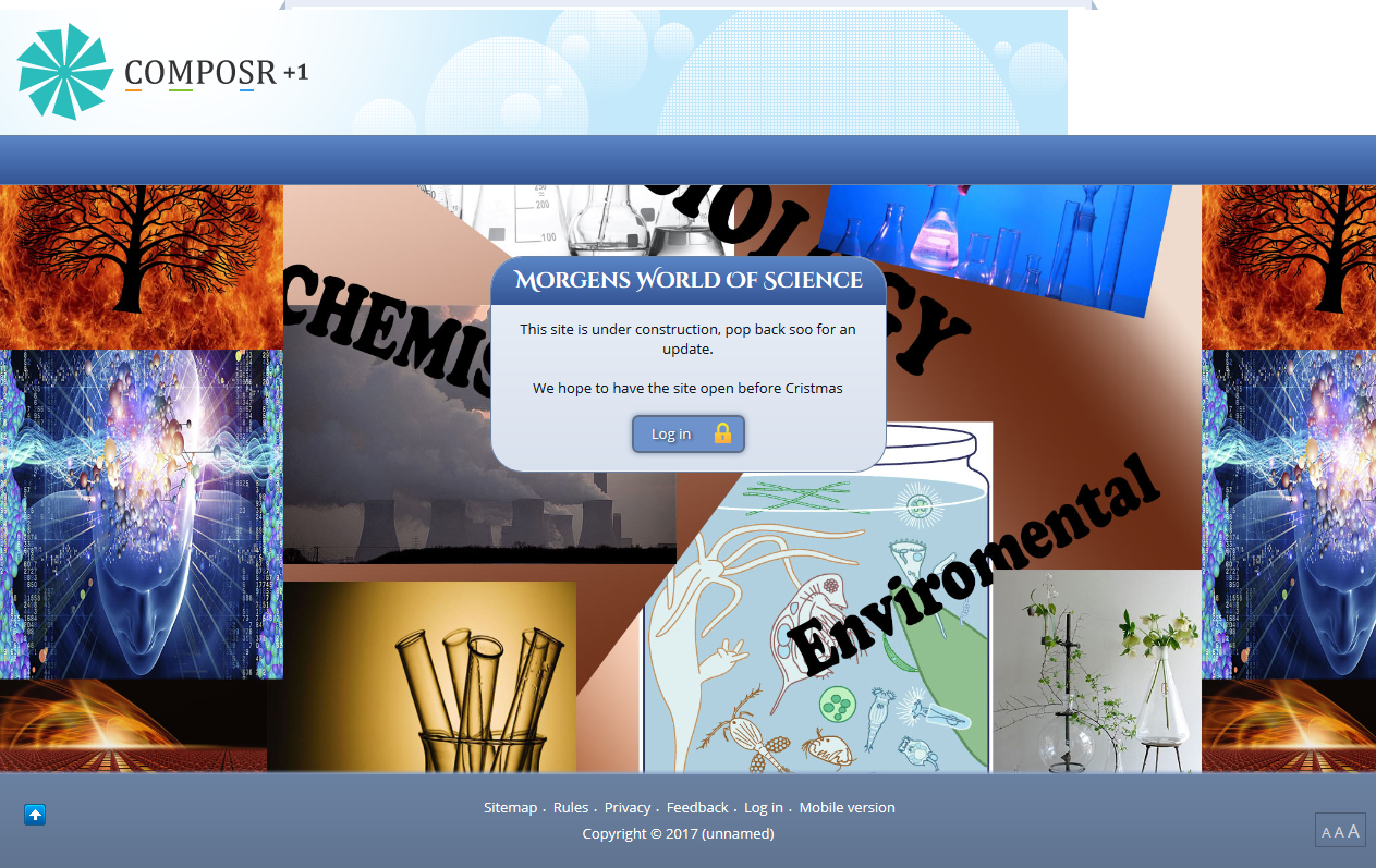
I think this is the maintenance mode page, infact i know it is, so we will need to change the box anyway. Its likely we will hard code in a message and make the box size fixed, this is because its mainly a site for one person, we know the laptop screen size etc etc. Vast amounts of people are not expected to use the site, if they were we would make it more 'responsive' and use flex etc more.
so the code in global before changes.
 and after
 This what we now have.
 Not to everyones taste, but you can change things following the above!
At the moment when you click on login, you get the following screen.... Because of the type of site, and age of person concerned, this page needs some thought. We might want to remove the register links and forgotten password links from this page, this isnt a decision for me. This is something i would need to have a chat with 'dad' about.
So we are not going to touch the screen for now, not untill we know if it needs touching or major changes.
![]() Last edit: by Chris Graham
Last edit: by Chris Graham
Posted
Posted
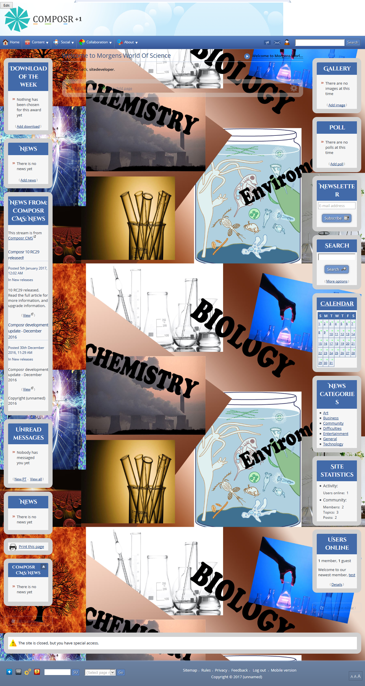
But we knew we would need to change things, so i have to read up on using ID to select pages or elements we want to change, without changing every box etc! So more after i have done some reading, and probably asked a few questions! This is further than i have gone before with this software….. We dont need all the boxes on the first page, but we leave them there for now. They can be toggled and messed with later, for now its better to leave them.
Also we need to learn how to make a new box, i cant any info on this, but thats most likely because i dont know what to look for! Gut feeling is we use pages.
I have that feeling because there is a excellent page with help bubbles on that Chris did. I will link to it later.
Ok so we had to do some reading and learning, and its taken alot of hours… But we now have this, plus we know more than we did!
Apparently the squashed look is something to do with NIMBUS screen shot, it has great editing but does squash the image.
![]() Last edit: by Chris Graham
Last edit: by Chris Graham
Posted
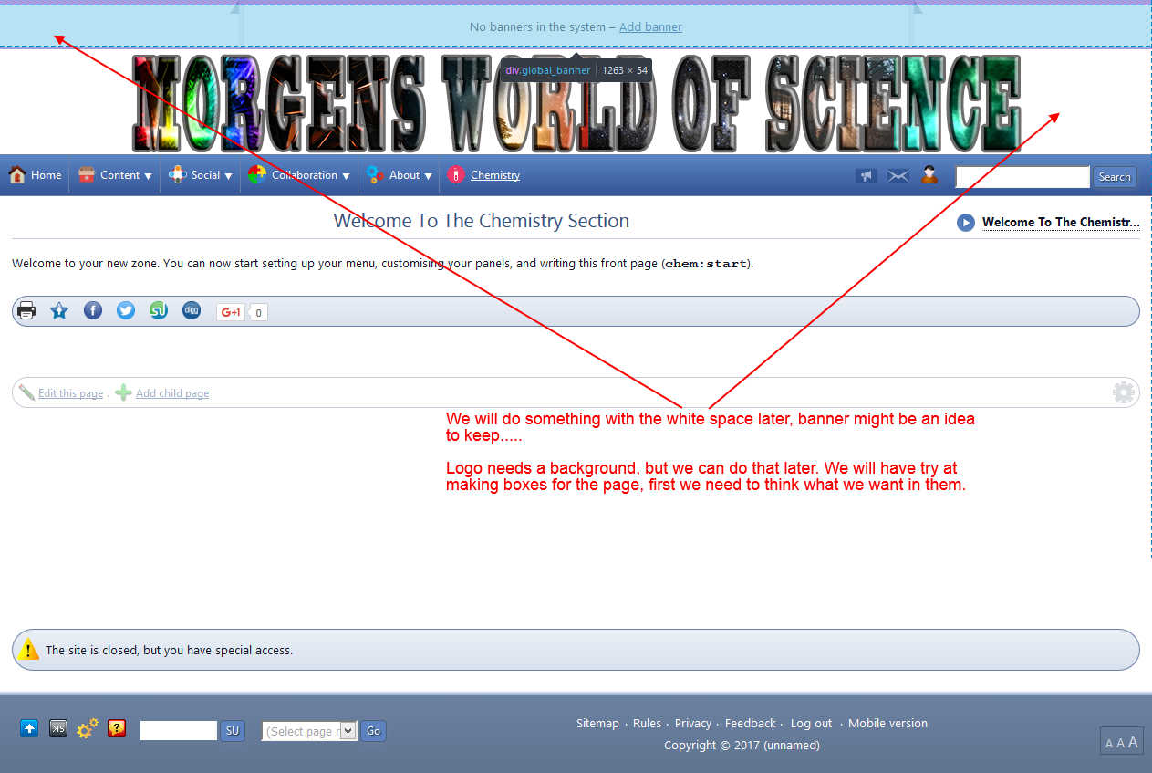
So while we think what box's we want on the page, we should add Biology Section etc.
Maybe the Chemistry zone should have been Science, but doing the science's separate, may give us more flexibility later.
![]() Last edit: by Chris Graham
Last edit: by Chris Graham
Posted

Moderator
lg11 said
The screen shots make it look far more squashed together than it actually is, i am not sure why that is, except i am using two different screen shot programs….
From “Post #1639”, 9th Jan 2017
I'll be fixing that in our next update.
What we dont know at the moment, is how do we select in CSS just that page to make changes on? I know we use ID, but at the moment i dont know hoe with composr…….I will need to work on that, or all pages will have the changes, and we dont want that!
Code
.page_running_whatever h2 {
   color: red;
}
Would only change the h2 colour on a page named 'whatever'. Hopefully that gives you the pattern you need.
Posted
I need to get a hold on selectors, the page one is useful thanks. It might also be a problem trying to do it in developer tools first… This is my first real deep look at CSS.
This is Morgens site, one of the original students i had. I might go back and change that page….looks even worse after sleep
 .
.I thought i would document it for her, that way she can change things etc, it might also help others.
Posted
Posted
Moderator
(See, we are all learning
 )
)
Posted
I have some books that have shed very little light on what i am doing!
So as an example i will use my other site.
Just as a random example, what code and where do i add it, to achieve the following.
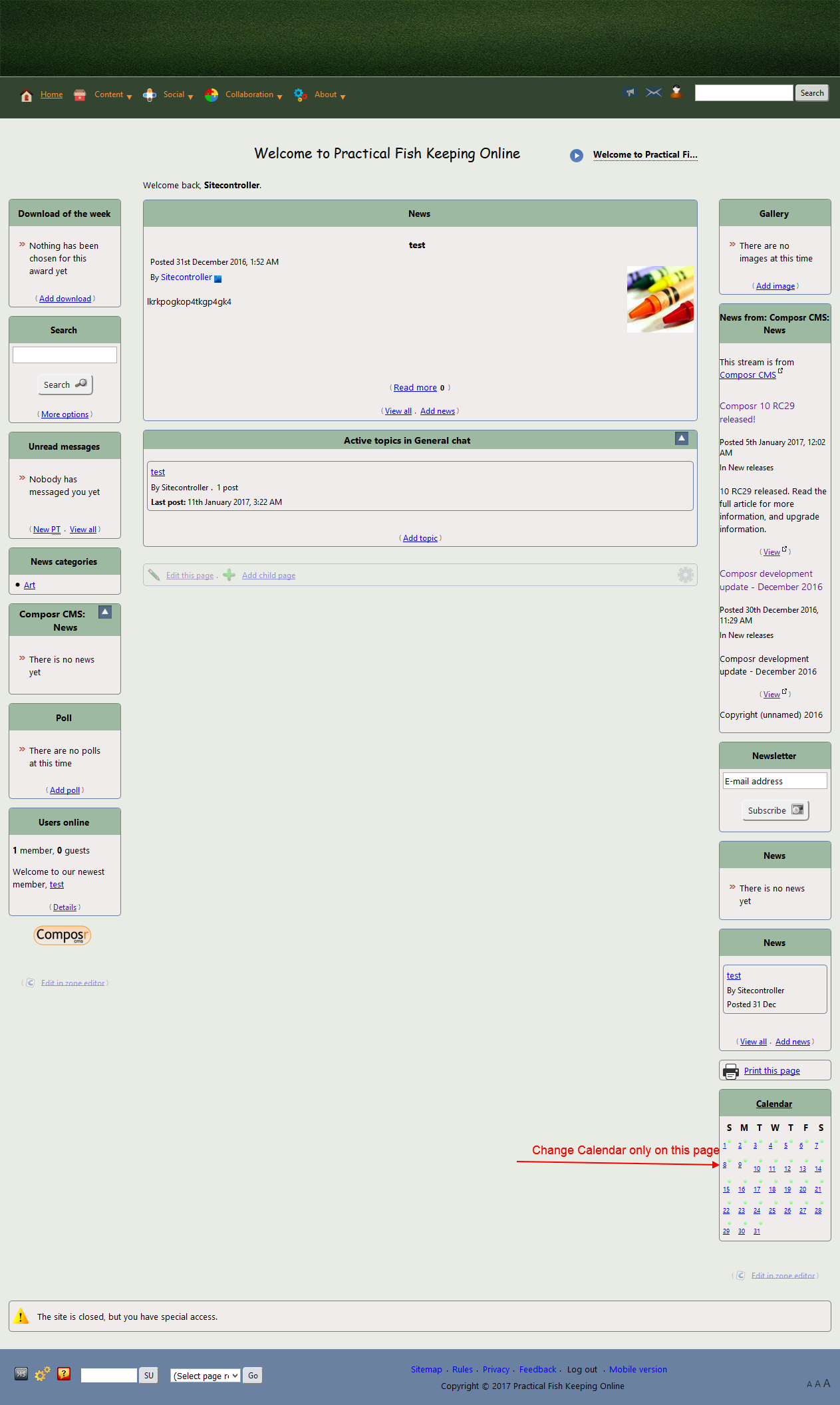
So that is how it looks now. Lets say i wanted an orange background on the calendar, but only on the collaboration page.
The developer gives the following information for the page.
So i can see the page etc and i have the box information as shown here.
So using that information, how would i turn the background on the calendar orange, just for that page, and where in which file do i make the changes?
Like i said i can do in the browser, via a new rule done inline, but i assume there is a better way maybe in Global.CSS? I have tried but didnt get it to work.
if you could do an example i can make changes from there, on different elements.
Thanks
Posted
Moderator
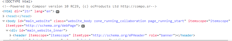
We can however be more specific and use the zone too.
Code
.zone_running_collaboration.page_running_start .box___block_side_calendar {
   background: orange;
}
It works because we put those zone/page classes on the body element (as can be seen in your second screenshot). We're doing a descendent selector, i.e. we're selecting against something with the class box___block_side_calendar but only if it is a descendent of something with both the class zone_running_collaboration and the class page_running_start.
It has to be in some CSS file that's going to be loaded. If in doubt, global.css, which is always loaded.
Posted
It looks like we will be using composr for the schools project. Ironically we cant use it yet for the commercial side
 . The reason is simple but inflexible.
 The Grant we have for software has to be spent on released software, dig down into the fine print and you discover, 'released' means non beta or RC releases.
part of me is gutted and part of me thinks no software is going to do what the group is asking. So maybe its better 6 sites fail on the other package, it might cause a rethink as to what they are wanting to do, by that time Composr should be long out of RC!
Technically the RC limit should also apply to what we use inside the schools for each site, but because its open source we are not paying for a license. Hence we dont need Grant money.
We will be donating money, but that is a whole different story. Each school wants the software skinned in the schools colours and to feel like its part of the school. Part of me is annoyed because we are independent of the schools. To our way of thinking the sites should all look like they are our project sites, the schools have zero financial input etc.
But that is all politics, work wise this is going to mean added expense for the project group. Especially if we have to get someone to template each school, that isnt going happen. Most of the funds go on equipment and chemicals etc, so instead i am going to try and make the themes for each school. YES all 400 odd!
I am no graphic designer (see above site!), but i am willing to give it a shot. I think by the time i reach site 399 i should be able to make a half reasonable theme.
If i do manage to get to grips with it, i would like to make and release themes for Composr, i find it relaxing to come home from peering down a microscope and working on the sites.
Anyway back to work on Morgens site!
Posted
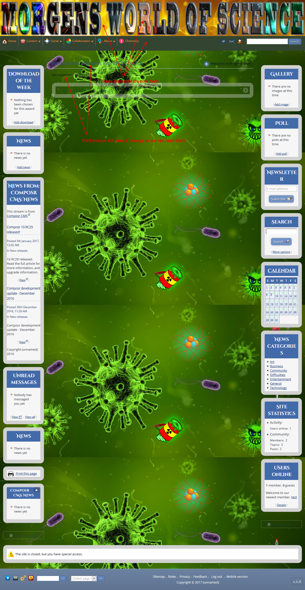
Anyway we are currently looking like this.
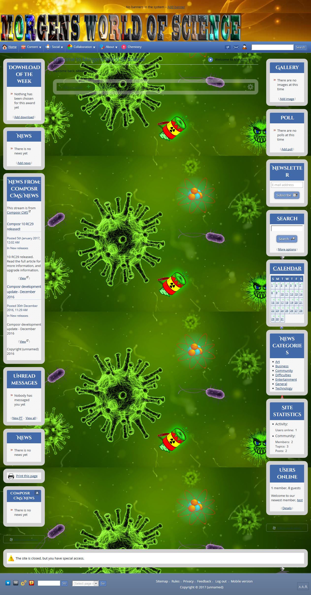
Still alot to change, and graphics are not my thing! I want to keep the banner space, but i will be changing the graphics there and behind the main heading logo.
For now i treat alot of the images as place holders
.
Posted
So looks like you need to be careful where in the file you put things….. This might prove a tad tricky for some of the things i want to do later.
Anyway progress is progress!
Posted
Moderator
lg11 said
Right i need to work on this site tonight, i want it done and dusted so the student involved can use it.
It looks like we will be using composr for the schools project. Ironically we cant use it yet for the commercial side
The Grant we have for software has to be spent on released software, dig down into the fine print and you discover, 'released' means non beta or RC releases.
part of me is gutted and part of me thinks no software is going to do what the group is asking. So maybe its better 6 sites fail on the other package, it might cause a rethink as to what they are wanting to do, by that time Composr should be long out of RC!
Technically the RC limit should also apply to what we use inside the schools for each site, but because its open source we are not paying for a license. Hence we dont need Grant money.
We will be donating money, but that is a whole different story. Each school wants the software skinned in the schools colours and to feel like its part of the school. Part of me is annoyed because we are independent of the schools. To our way of thinking the sites should all look like they are our project sites, the schools have zero financial input etc.
But that is all politics, work wise this is going to mean added expense for the project group. Especially if we have to get someone to template each school, that isnt going happen. Most of the funds go on equipment and chemicals etc, so instead i am going to try and make the themes for each school. YES all 400 odd!
I am no graphic designer (see above site!), but i am willing to give it a shot. I think by the time i reach site 399 i should be able to make a half reasonable theme.
If i do manage to get to grips with it, i would like to make and release themes for Composr, i find it relaxing to come home from peering down a microscope and working on the sites.
Anyway back to work on Morgens site!
From “Post #1692”, 14th Jan 2017
That's a shame
 .
.Anyways, as for unique looking designs, you can probably just use the theme wizard to pick a colour and slap their logo on. That's how most people approach custom looks.
0 guests and 0 members have recently viewed this.