Composr Supplementary: Customising Your Composr Website's Design
Written by Steve Jarvis, Sponsored by Arvixe hosting
Potentially Outdated Tutorial
This supplementary tutorial might be outdated as it was written for a previous version of Composr CMS (version 10). Version 11 introduces a completely re-designed interface with much more powerful tools.
How knowledgeable you are in CSS and HTML will determine how detailed a customisation you will be able to make. This tutorial aims to make it easier to find your way around the files you need to edit.
The Theme Wizard
Composr Theme Wizard
Scroll down the page a little and click the Theme Wizard link. Your first task will be to give your theme a name and then choose the seed colour for the theme. The seed colour determines all of the colours on your basic theme from the colour of menus to the colour of links. This doesn't mean everything will be that colour but will be a variation of that base colour which compliments the theme.
To do this you can either use the sliders which are available or input a HTML colour code which will look something like #232246. The next option is for you to choose between equations or HSV Shift. This is a choice between setting the colours for each element via some clever automated maths, and just simply re-tinting the a theme. The former is the normal one to use, the latter is useful for custom themes that don't have good Theme Wizard support in them.
Next you choose whether you are making a dark based theme or not. By this I mean whether you intend to have the main body of your site using a dark colour and light coloured text on top of it.
The final option on this page is a choice whether to edit the main CSS files or create smaller versions which overwrite certain elements. By creating one main set of CSS, it will be easier to find the elements to change. However, a smaller set which overwrites the original elements will be easier to modify when the software is upgraded.
After you click Proceed you will be taken to a preview of your site with the new colours and you can either choose to return back to the colour seed selection screen to make changes to the seed colour or accept the changes. If you choose to proceed you can then use the theme on all zones. In many cases you will choose this, but if you are working on a new design while your site is live you will want to untick (uncheck) this option.
Main theme options
When you return to the themes page you will find yourself looking at both the original default theme and a set of options for your new theme as shown in the screenshot below.Composr theme options
The first part of this table includes information about your new theme such as its name and the seed colour you have used. There are other options for seeing previews of your site and previews of each template used in the site. These previews allow you to easily see how each element of your website make-up will look before making them live. You can also export your theme from here if you plan to allow others to use the theme.
Composr theme image chooser
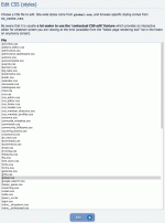
Composr CSS choice screen
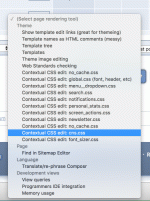
Page rendering (contextual) options in the site footer
The third cell is the link to edit the CSS of your theme. Behind this option is a list of all the CSS files which are used within your theme which can be edited. The most common choice here will be global.css as this houses the most commonly used CSS elements. To help you find the correct element on your live theme there is an option in the admin dropdown box at the bottom of the standard theme called a contextual CSS editor. Once this is chosen a new window will open up and as you hover over elements on your live site each CSS element will be highlighted on the new screen.
This feature is completely unique to Composr and offers an extremely powerful themeing tool. By using this tool you can quickly see what areas you need to edit to make your site appear just as you want it to. An extra benefit is you can also see which other areas of the site your changes might affect. Obviously I can't tell you exactly what to change as you will want your site to be representative of your ideas.
The next cell relates to the editing the templates of your website theme. Like the CSS page, you will be presented with a list menu of all of the templates which are used with your site. Some of these will affect just one content block and others will affect large portions of your site's structure.
The final section relates to all of the images which make up your theme. These are separated in to sections such as logo images and general images e.g the favicon and apple icon. From here you can quickly edit and update the various theme images which make up your site.
From the above you can see Composr's themes can be pretty complex, but the developers have spent time making and refining these really powerful theme design features which you won't find in any other Open Source CMS. If you just want a different colour and a few minor changes to the default theme then Composr offers you the Theme Wizard to achieve this in a matter of seconds. If you want to make a massive conversion of the software you have all of the tools at your disposal to be able to efficiently find the individual elements you need to change.
Feedback
Please rate this tutorial:
Have a suggestion? Report an issue on the tracker.


